Facebook ads can be a powerful way to reach your target audience and generate leads and sales for your business. But creating an effective Facebook ad takes more than just throwing some text and images together. The design of your Facebook ads can make or break their success.
In this post, we'll explore 10 essential tips for Facebook ad design that grab attention and drive clicks. Follow these Facebook ad design best practices to create visually compelling ads optimized for high click-through and conversion rates.
Keep Text to a Minimum
Facebook ads need to convey messages quickly in limited space. Keep copy short, sharp and scannable.
Aim for 20-25 word headlines and descriptions. Get straight to your key selling point or offer ("50% off T-shirts"). Extra details can go in a short body text section - 1-2 tight paragraphs or bullet points max.
Minimizing unnecessary text does two jobs: it forces you to focus only on your most important message, and it saves space for compelling visuals to grab attention. Remember - before they start reading, viewers glance at images, logos and layout first. Support minimal copy with eye-catching graphics for greater ad impact in Facebook feeds.

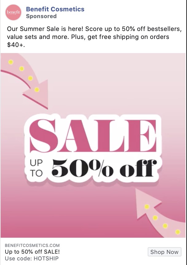
This advertisement targets Big Sales and 50% off without needing to write many cumbersome descriptions.
Simple Typography for Scannability
The typography you choose impacts how easily your minimal ad copy is scanned and absorbed. Though decorative, funky fonts grab eyes, they prove tough to quickly read.
For fast readability, use simple, bold sans-serif fonts like Arial or Helvetica. Avoid thin, elegant scripts or elaborate display lettering. Clean, straightforward fonts put the focus on your message instead of the type design.
Make sure overlays on images remain readable too. Boost font weight and size. White backgrounds behind the text enhance clarity. Avoid busy backdrops like crowd scenes or landscapes competing for attention.
Stick to just one or two harmonious, unfussy fonts across headline, body text and captions. Too many clashing styles clutter communication. If using a secondary accent font, reserve it just for highlighting important details like sales discounts or deadlines.
Well-chosen typography seamlessly transmits your offer into the minds of viewers. It disappears behind the strength of the copy’s persuasive power. When crafted thoughtfully, the design of the words themselves disappears - leaving only their ability to trigger clicks and conversions.
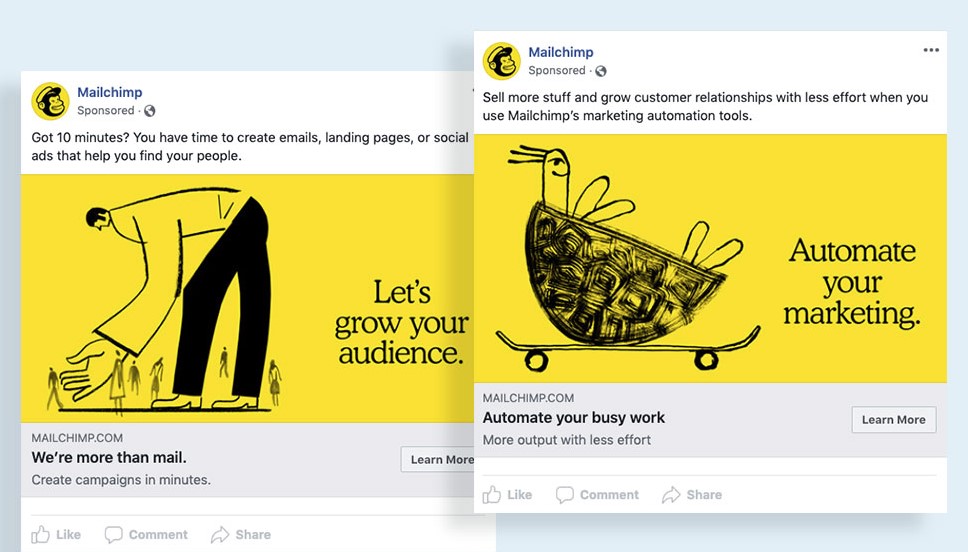
Make it Pop With Color Contrast
Facebook's busy news feeds bombard users with eye-catching videos, photos and headlines all vying for attention. Make your ad content pop out from the chaos using contrast.
One easy but highly effective technique is using complementary colors that sit opposite each other on the color wheel – blue and orange, purple and yellow, red and green. These color combinations create natural vibrancy that catches viewers' eyes.
You can apply color contrast in:
- Typography - pair a brightly colored font with a dark or white background
- Graphics - vibrant images attract more initial glances
- Overlays - colored text overlays will stand out better on a contrasting background
The starker the difference the better. Black and white make the strongest contrast for clean text and graphics. Also use contrast for borders, backgrounds, framing shapes, etc.
Many elements combined create an ad that leaps off the screen when scrolling. If your marketplace is highly visual like fashion, home goods, or photography, optimizing graphic vibrancy through smart color choices could drastically boost engagements.
Let color contrast highlight the most important or actionable part of your ad content. Guide viewers straight to your call to action or discount code by making it the most eye-catching aspect. Use contrast both to draw initial attention as well as direct it.
Talk about popping off the screen! This Facebook ad grabs attention by using two bold, contrasting colors.
Optimize Ad Creative for Each Placement
The three main Facebook ad placements – desktop feed, mobile feed, and right column – each have unique size requirements and user behavior patterns. Rather than taking a one-size-fits-all approach, tailor your visual design and copy to maximize performance across placements.
First, study your target audience. Do they primarily use Facebook on mobile or desktop? Are they active in Stories, Marketplace etc? Let this guide where you focus creative efforts and ad spending. For example, an ecommerce store with mostly mobile users would optimize for vertical mobile formats.
You can also use Facebook's Automatic Placements and they will test across placements, automatically optimizing for the best-performing. But performance lifts when you manually craft complementary versions tailored to each ad environment. Think about how scrolling behavior differs on desktop and mobile, and even placement positioning within the feeds.
When designing multiple iterations, consult Facebook's latest creative specifications guidelines for each format. Check recommended image dimensions, aspect ratios, text length limits and video lengths for the various positions. Consider vertical vs square vs horizontal orientations. How will imagery and text appear while scrolling past?
With strategic and intentional creative choices for each situation, your ads will connect far better across the full range of Facebook placements.
Microtarget Your Ad Creative
One of Facebook advertising's most potent advantages is its unparalleled ability to microtarget campaign elements to hyper-specific audiences. With access to users' personal interests, demographics, behaviors and more, you can create highly customized ad versions tailored to neatly defined market segments.
For example, a clothing retailer could promote its women's workwear collection only to female office professionals aged 30-45 living in major metros. Similarly, its weekend leisurewear could target 20-something outdoor enthusiasts within 50 miles of its stores.
When microtargeting ad creative:
- Research your niche audiences on Facebook to identify unique preferences to leverage
- Feature relevant visuals, captions and offers aligned to each group
- Adjust tone, humor and even colors/fonts to better resonate
- Test a variety of creative styles among the segments to determine what performs best
The beauty lies in optimizing ads to align with a niche rather than taking a one-message-fits-all approach. Include elements that feel like they were crafted just for that special interest group. Love of pets, thrill seeking, eco-consciousness - whatever distinctive traits define them.
Hyper-customizing for pinpointed demographics helps you stand out from broad generic ads and forge stronger connections that convert. Microtargeting taps into Facebook's advertising superpower - unprecedented insight into exactly who wants what.
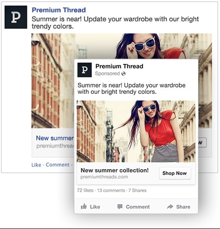
This ad targets women who like to wear cool, trendy clothes in the summer.
Strategize Format Before Design
With 8+ core ad formats, first select which style aligns best with your campaign goals before creative concepting. Different formats suit different objectives:
- Photo / Video: Spotlight a single powerful image/video to tell or sell your story. Craft visual-first creative that grabs attention.
- Stories: Immerse viewers in full-screen vertical experience. Use all available space for maximum impression.
- Carousel: Showcase up to 10 images/videos, each with unique link. Ideal for product ranges or visual narratives.
- Slideshow: Combine images + audio in data-friendly package. Engage areas with poor internet connectivity.
- Collection: Virtual product catalogue. Display goods in simple uniform product shots.
- Playables: Interactive games/demos highlight app utility pre-download. Entertain niche users.
- Messenger: Tight message targeting Messenger users. Lean on bold images + clear concise copy.
Consider ad objectives, product display needs, customer targeting and creative bandwidth. A single killer photo ad may work for a startup launch campaign, while an ecommerce site may leverage Carousels to exhibit product lines.
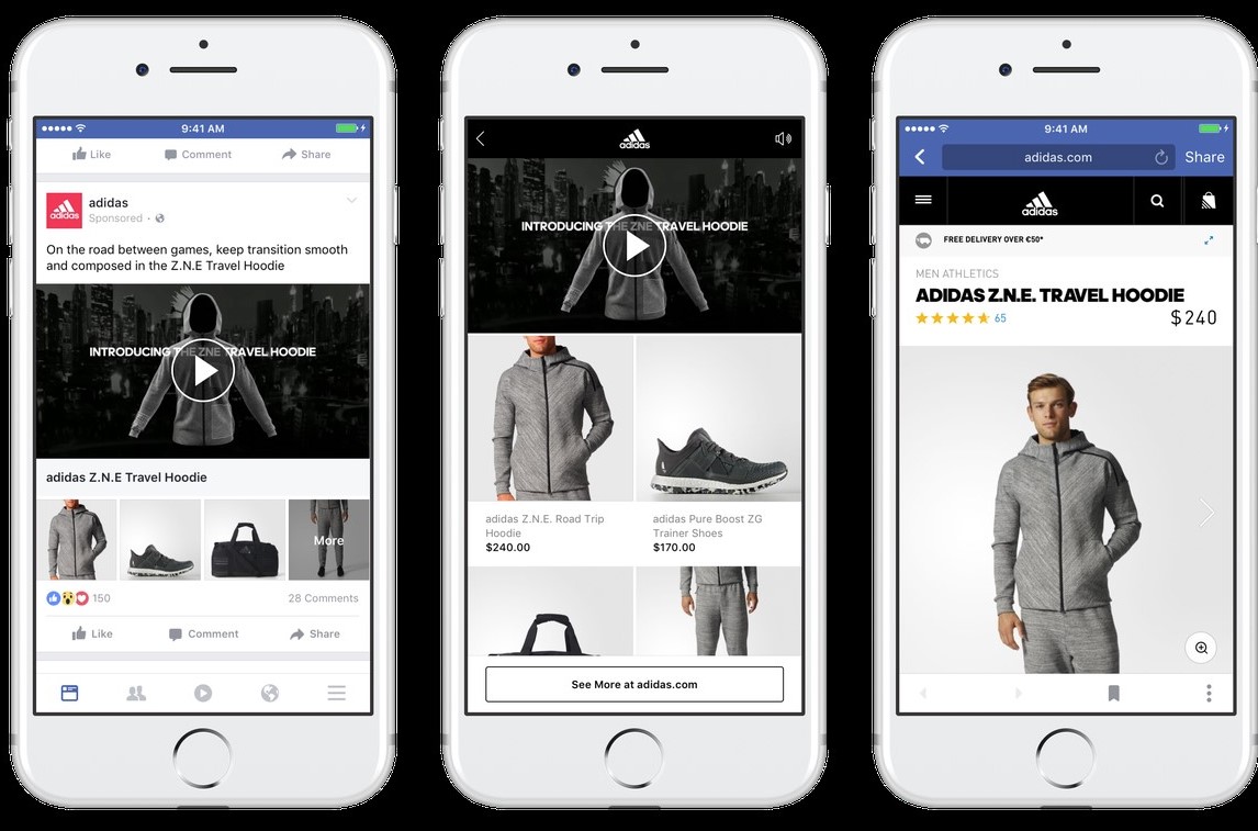
Match format to goals for better results. Henge Docks’ clever Carousel ad showcases its full range of docking station designs in coordinated layout. Had it squeezed various products into single images, it would dilute impact.
Map your ideal ad journey before designing for each placement. Combining a strong conceptual format foundation with tailored creative better conveys your message tomove audiences from impression to conversion.
Spotlight Value and Calls to Action
Clarity is king when vying for hyper-short attention spans on Facebook. Ensure viewers immediately grasp your ad’s core selling proposition within 3 seconds of glancing. Prominently display your product or service’s primary value-add through concise text or self-evident visuals.
If promoting a sale or special deal, put discount details front and center. Consider overlaying percentages or strikethrough dollar amounts over lifestyle imagery. For physical products, combine descriptive captions with appetite-appealing product close-ups. Benefit-focused taglines placed strategically guide eyes directly to your hook.
Once you’ve highlighted super-clear unique value, drive desire into action with a strong call to action (CTA). Contrasting colors/sizes help CTAs stand out – as does positioning near natural next step areas like image corners. Provide contextual motivation too: “Find tires to fit your vehicle” / “See yourself wearing these frames”.
Streamline every design choice to funnel focus onto your #1 selling point and CTA. Declutter interfaces and pare back peripheral elements that dilute messaging. White space and visual breathing room prevent cognitive overload.
With defined value exchange and clicks made effortless, curiosities convert into leads and sales. Users ultimately ask “What’s in it for me?” Make the ‘it’ impossible to ignore thanks to smart emphatic design.
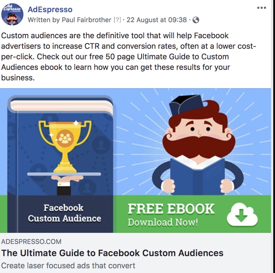
This Facebook ad highlights helps users click to receive a free Ebook.
Optimize for Proper Ad Dimensions
The right image sizes and dimensions are crucial for aesthetics and delivery.
For Facebook News Feed image ads:
- 1200 x 628 pixels - 1.91:1 aspect ratio (recommended)
- 1200 x 1200 pixels - 1:1 aspect ratio also works well
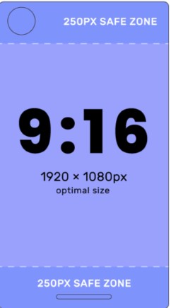
For Facebook Stories:
1080 x 1920 pixels - 9:16 vertical aspect ratio
Follow Facebook's latest requirements to avoid distortion or cropping. Images will appear crisp and professional.
The ideal width is 1200 pixels so images don't get awkwardly cropped or stretched. But oversized graphics slow load times without improving visual impact.
Proper dimensions also allow you to maximize space and highlight your key messages. Poor formatting wastes valuable real estate and obscures details.
By fine-tuning technical specifications, your visuals will capture attention at first glance. Flawless images and video convey quality and boost results.
Invest time upfront getting image sizes right. Your ads will thank you through higher engagement, clicks, and conversions.
Harness the Science of Color Psychology
With 90% of snap judgement about products attributed to color, deliberately apply palettes strategically attuned to your target market. Beyond eye-catching attention-grabbing properties, specific colors subconsciously spark different psychological reactions that can make - or break - conversion rates.
Red conjures feelings of excitement and energy, appropriate for bold calls-to-action. Conversely blue evokes trust and stability - ideal for financial service providers. Green implies health and nature, befitting brands selling eco-products or produce boxes. Orange funnels cheer and vibrancy suitable for party brands and events.
Additionally, generational color preferences exist. Older audiences gravitate towards blues and purples while youth responds more strongly to hot reds and oranges. Context also plays an integral role in interpretation.
While rainbow blasts suit a children’s hospital charity, that same vibrant scheme could undermine perceptions of dependability for say, a wealth advisor. Instead muted, classic palettes telegraph enduring qualities there.
Take stock of both market expectations and optimal emotional triggers when developing color themes. What qualities do you want viewers to assign to your offering? Trust? Security? Friendliness? Modernity? Map properties to precise shades shapes perceptions and guides response.
With both science and consumer insights as creative guides, hues evolve beyond mere aesthetic decoration into powerful influencers that tip decisions for or against a click. Wield judiciously and witness enhanced engagement unfold.
Sophistication & Luxury: Pale pinks exude a sense of refinement and elegance. They evoke images of delicate blooms, romantic sunsets, and high-end beauty products.
Optimize for Vertical Mobile Screens
With 94% of ad revenue is from mobile users, craft ads specifically for thumb-scrolling behaviors on smaller devices. Tailor dimensions, frames and aspect ratios towards dimensions that feel native in feeds.
VERTICAL is the name of the game for mobile users glued to portrait phone screens. Prioritize full-bleed vertical images, videos and cinemagraphs that fill phone displays edge-to-edge. Avoid letterboxing horizontal compositions awkwardly truncated by mobiles.
Eliminate need for excessive scrolling or panning side-to-side by consolidating succinct messaging in easy-to-digest captions overlayed directly on compelling visuals.
Interactivity also thrives on mobile. Leverage thumb-swipe actions via card-swiping carousels to showcase product lines or journey sequences. Tap-and-drag cinemagraphs feel more responsive than static images to reveal hidden details in clever ways.
Remember to lead visitors to mobile-friendly destinations post-click too. Smooth site performance on cell networks breeds confidence to browse and buy. Slow load times hamper user experience.
With mobile-centric feeds commanding majority attention, purposeful mobile-first creative cuts through noise to engage. Brand Qantas runs vertical travel inspiration video ads with minimal but evocative captions that feel flawlessly native to mobile users dreaming up next destinations. Meet ultra-important mobile moments with creative solutions tailored to the medium.
By following key strategies like minimal text, strategic use of color contrasts, microtargeted messaging, and designing first for mobile, you can create Facebook ads that grab attention and drive action. Keep these core Facebook ad design tips in mind as you develop creatives optimized to connect with audiences and accomplish campaign goals through this uniquely personalized advertising platform.

Mohamed Fouad is a full-stack web developer and an entrepreneur who's really into advertising. He is the CEO of Rent Ads Agency, a company that helps businesses reach more customers through advertising. He graduated from Stanford University in 2018 and has over 4 years of experience in the tech industry.